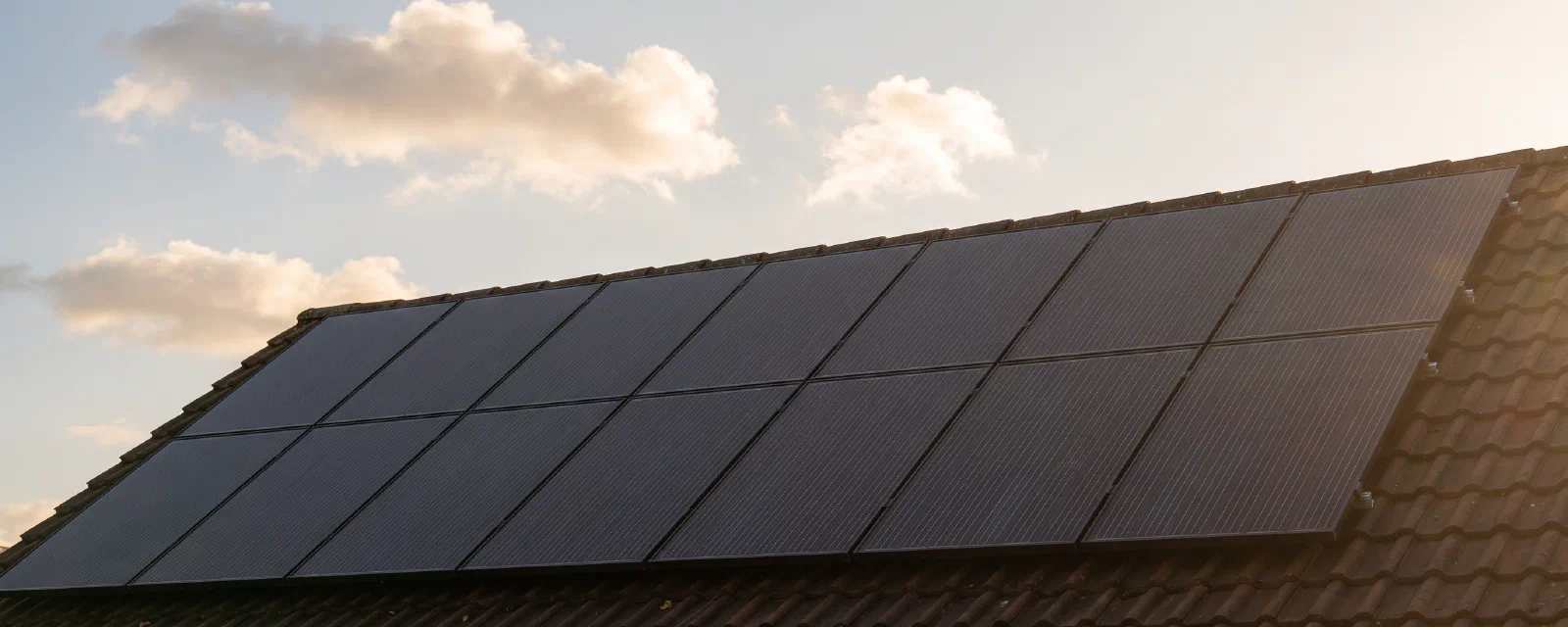

Two years ago, on a sunny September morning, twelve dark rectangles appeared on my roof. There were no smart-home dashboards yet, no energy monitor, no fancy inverter telemetry — just an installer, a few drills, and three APS DS3 micro-inverters wired into the household fuse box.
This post is the answer to the question everyone asks after the install crew leaves: what has the installation actually done for me since?
I have 24 months of measured data: monthly production reports from the inverters, monthly grid import from the network operator’s Linky meter, a year-end invoice from the feed-in tariff contract, and a live Home Assistant instance that pulls production and grid registers in near real-time. Everything below comes from those sources — nothing modelled, nothing extrapolated beyond a one-month interpolation for the peak / off-peak split.
Quick disclosure before the numbers: I am not an installer, an electrician, or a financial adviser. The figures below are my own household’s data, and they will not match yours. Tariffs vary by country, by contract, and by year. Nothing here is investment advice.
TL;DR — the headline numbers#
| Metric | Value |
|---|---|
| Panels | 12 (≈ 6 kWp) on 3 APS DS3 micro-inverters (4 per inverter) |
| Commissioning | September 2024 |
| Total production (24 months) | 12,461 kWh |
| Self-consumed | 7,572 kWh (60.8 %) |
| Surplus exported / paid under the OA tariff | 4,889 kWh |
| Estimated total gain (avoided purchases + OA resale) | €2,234 |
| Estimated payback on a €13,000 (incl. tax) install | ≈ 11.1 years |
The interactive dashboard behind those numbers — production, import, monthly balance, gain and cumulative total — is at /solar-analysis/. It is the same data the rest of this post is built from; everything below is summarised, the dashboard is explorable.
The setup, briefly#
- 12 panels, evenly split into 3 strings of 4 (one string per micro-inverter). No optimizer per panel — the DS3s do their own MPPT per panel.
- No battery. Whole surplus is fed back to the grid and paid under the French “Obligation d’Achat” (OA) residential contract at €0.1301/kWh (Tier 1, capped at 9,600 kWh/year), then €0.0500/kWh above.
- Tariffs used for the avoided-cost calculation (all-in TTC, EDF-style base option): peak €0.2110 / kWh, off-peak €0.1624 / kWh, fixed subscription €30.59 / month. I assume self-consumed solar mostly replaces peak-hour purchases, which is the conservative assumption for a household without a deliberate load-shifting setup.
- Monitoring: Home Assistant with:
- the APS ECU energy counter (
sensor.ecu_lifetime_energy, currently 12,476.8 kWh), - the official micro-inverter monthly report (the numbers behind every chart here),
- the Linky “active energy injected” and “active energy withdrawn” registers.
- the APS ECU energy counter (
A more detailed discussion of whether to add a battery now, given these numbers, lives in my earlier French post Une batterie solaire est-elle rentable en 2026 ? — short answer for the English audience: not yet, the savings are too small relative to battery cost unless your tariff structure changes.
Year 1 vs. Year 2 vs. last 12 months#
The summary table below is taken from the dashboard’s “Yearly summary” block, which uses each year’s invoice for Year 1 and the Linky injection register for Year 2. Year 2 is partial (data through 10 Aug 2026).
| Period | Production | Self-consumed | Surplus exported | Avoided | OA resale | Total gain |
|---|---|---|---|---|---|---|
| Year 1 (Sept 2024 → Aug 2025) | 6,498 kWh | 4,067 kWh | 2,431 kWh | €858.18 | €316.26 | €1,174.44 |
| Year 2 (Sept 2025 → Aug 2026, partial) | 5,963 kWh | 3,505 kWh | 2,458 kWh | €739.59 | €319.78 | €1,059.37 |
| Last 12 complete months (Aug 2025 → Jul 2026) | 6,429 kWh | 3,801 kWh | 2,629 kWh | — | — | €1,144 |
| 24-month total | 12,461 kWh | 7,572 kWh | 4,889 kWh | €1,597.77 | €636.04 | €2,233.84 |
A few things stand out:
- Production was flatter across years than expected. Year 1 looked a touch sunnier than Year 2 — Sept 2024 to Aug 2025 was 6,498 kWh vs. 5,963 kWh Sept 2025 to Aug 2026 — but the rolling 12-month window (6,429 kWh) sits neatly in between, suggesting mostly weather noise rather than a downward drift.
- Self-consumption share stays in the 60 % band. Roughly 60.8 % of every kWh produced was used on-site. Caveat: this 60.8 % is a reconciled figure anchored to the Year-1 OA invoice and the Linky “active energy injected” register — see the methodology section. Pulling from VictoriaMetrics (the long-term store behind HA), the EV absorbed roughly 588 kWh of solar over the 17 months since the Trydan was installed (April 2025 → August 2026, see the EV-section tables below). That is about +5 pp of true self-consumption on top of the 24-month total — which is why the 60.8 % figure is best read as a floor, not a true present-day value.
- Surplus is creeping up (2,431 → ~2,458 kWh). That tracks with summer-heavy Year 2 — more peak-hour sun, more export. Year 2 production itself is slightly lower, but the share of it that arrives when nobody’s home is higher.
How I trust the numbers#
Production is the easy bit — the micro-inverter monthly report is essentially bank-grade: it is what the invoice is built on.
Self-consumption is the harder bit. The trick I use is this:
- In Year 1, the OA surplus I was paid for is exactly 2,431 kWh. That value is on the invoice and is not an estimate.
- I back out a “daily self-consumption baseline” by trial-and-error (binary search, technically) until the modelled Year 1 monthly production minus that baseline reproduces the 2,431 kWh surplus at the end of the year. The baseline that does this for Year 1 is 13.54 kWh/day and for Year 2 is 12.44 kWh/day (lower because Year 2 is partial and winter-heavy months dominate the first half).
- The monthly self-consumption figures shown in the dashboard are the result of that model — they’re consistent with the invoice-grade surplus total but are not invoice-grade themselves.
It is not a perfect decomposition. The split between self-consumed peak and off-peak hours is approximated by interpolating the Linky peak/off-peak indexes onto each day. If you came here looking for sub-day resolution, the smart-meter pipeline that produces that is on the to-do list.
The interactive dashboard#
Everything above is summarized. The dashboard at /solar-analysis/ is the same data, interactive.
It shows four charts across 24 months:
- Monthly production — from the inverter report, exact.
- Monthly grid import (peak / off-peak) — from the network operator’s monthly statements, peak/off-peak split by interpolation.
- Monthly balance — production decomposed into self-consumed, surplus exported, and grid import (stacked).
- Monthly gain and cumulative gain — gain bars with a line for cumulative total.
Plus the yearly summary table, a 12-complete-months rollup, a before/after grid-import comparison, and methodology notes.
A few honest reasons I did not iframe it into the post:
- The page is tall (four charts plus tables). On mobile it would force-scroll for a long time before getting back to the story.
- The Chart.js bundle is non-trivial and would re-download on every post pageview. As a separate page it is fetched only when someone actually wants to explore.
- It is easier to share as a standalone URL — useful for installers showing clients what “24 months of measured data” looks like.
The V2C Trydan and the EV charging loop#
The biggest single behavioural change in this household after the panels went up was the V2C Trydan wallbox in the garage, which charges whichever of the two EVs is plugged in. It is configured in full solar mode (the V2C app’s wording; in Home Assistant this looks like the select.charge_mode set to mixed — which only controls phase switching, plus the dynamic intensity modulation switch on, which is what actually implements the no-grid-floor behaviour): the wallbox draws only as much current as the surplus solar allows, throttling down to the minimum and pausing entirely when the production is too low. The wallbox does not pull a 2 kW floor from the grid in normal day-to-day use — there is an alternative V2C config that does, but it is not the one in use here. When the car is plugged in overnight and the HC window opens, the wallbox will resume a full-grid charge at 11 kW to reach the target SoC; that path is rarely taken in practice (see the hour-of-day chart below).
Concretely, the Trydan is currently set up with:
- Charge mode:
mixed(HA select — controls phase switching; the V2C app calls the actual “no grid floor” behaviour full solar, with dynamic intensity modulation on) - Dynamic intensity modulation: on
- Min intensity: 6 A per phase (≈ 1.4 kW single-phase / ≈ 4.1 kW triphase — the Trydan refuses to charge below this even if surplus is smaller, to avoid the car complaining about the very-low-current pilot signal)
- Max intensity: 16 A per phase (3 × 16 A = 11 kW triphase — peak observed in the data is 10.67 kW, which confirms triphase)
- Live sensors in Home Assistant:
sensor.evse_10_0_0_120_charge_power(current draw, W),sensor.evse_10_0_0_120_house_power(whole-house draw seen from the EVSE perspective),sensor.evse_10_0_0_120_photovoltaic_power(PV seen from the EVSE perspective),sensor.car_solar_percentage(% of EV charging currently coming from solar — derived from the previous three),sensor.car_average_charge_power(kW, average over the active session), and the long-termutility_metersensorssensor.car_daily_energy,sensor.car_weekly_energy_meter,sensor.car_monthly_energy_meter(kWh from the wallbox’s own energy counter) plussensor.car_daily_solar_energy,sensor.car_weekly_solar_energy_meter,sensor.car_monthly_solar_energy(kWh from solar, =min(charge_power, photovoltaic_power)).
In full solar mode the car becomes the most elastic load in the house. When a sunny morning turns into a cloudy afternoon, the Trydan throttles from 16 A per phase down toward the 6 A minimum; if a cloud edge lines up with the car drawing too, the residual is indeed pulled from the grid — but only until the dynamic intensity modulation decides to pause the session entirely (it does, when surplus goes below ~1.4 kW / 6 A). The honest framing is therefore not “most of the OA surplus is solar the car could not absorb” but rather: the EV absorbs a real but bounded share of the surplus (see the numbers below).
That reframes the 60.8 % number meaningfully: it is the share of production that left the panels and was consumed on-site — including the EV. When we split it, the picture over the 17 months since the Trydan was installed looks like this:
| Pool (Apr 2025 → Aug 2026) | kWh | share of production |
|---|---|---|
EV from solar (min(charge_power, photovoltaic_power)) | 588 | ~4.7 % |
| Rest of house from solar (fridge, internet, cooking, hot water, midday cumulus…) | ~3,000 | ~24 % |
| Total self-consumption | ~3,590 | ~29 % |
| Surplus exported to grid (OA-paid) | ~4,889 | ~39 % |
| EV from grid (night charging, peaks above solar) | ~2,388 | ~19 % |
| Rest of house from grid (Linky import) | ~1,594 | ~13 % |
| Total production | ~12,461 | 100 % |
The 60.8 % figure on the dashboard is a 24-month headline (Sept 2024 → Aug 2026) that includes both pools. Over the 17 EV-bearing months, EV-from-solar is ~12 % of the OA surplus — a real chunk, but not “most of it”. The remaining ~88 % of the surplus is genuinely headroom the rest of the house could not absorb. The dashboard does not currently separate these two pools; the OA invoice and the Linky “energy injected” register see the same thing regardless. Splitting them properly needs a small post-processor script that pulls sensor.evse_10_0_0_120_charge_power and sensor.evse_10_0_0_120_photovoltaic_power from VictoriaMetrics — the data is there, it is just not surfaced in the dashboard yet.
Honest data note. Home Assistant’s long-term-statistics recorder on the EVSE sensors only retains ~7 days for the v2c platform, which is too short for annual aggregates. To get the 17-month numbers above, I went one layer down to VictoriaMetrics (the long-term store HA exports to via InfluxDB). The same data is also captured by a pair of
utility_meterhelpers already wired in the live config (sensor.car_daily_energy,sensor.car_monthly_energy_meter,sensor.car_daily_solar_energy,sensor.car_monthly_solar_energy— the latter ismin(charge_power, photovoltaic_power) / 1000). The headline ~20 % solar share in the table above is a lower bound: the 1-hour VM step undercounts short bursts and the few days where the exporter sampled only once, so the true share is likely a few points higher. The 73 % daytime solar share is from the same data and is more robust.
The two water heaters and the midday HC window#
The second elastic load worth describing is the pair of electric water heaters — one in the cellar, one in the garage. They were originally wired to the standard EDF HC programme (off-peak hours roughly 22:30 → 06:30 in winter, shifted later in summer), which is the cheapest grid energy but also the worst match for solar.
The idea I wanted to test was simple: instead of running them at night, push them into the midday HC window (~12:00 → 14:00 local) — the only time of day when the contracted price is the HC tariff and the sun is close to its daily peak. On a sunny day, the heaters then run mostly on solar; on a cloudy day, they still run on the cheaper HC grid. Either way, they avoid the peak-hour tariff.
Home Assistant makes this trivial to automate. The pair is switched by a single relay on a Shelly EM energy meter (switch.energy_meter_cumulus), and the two cumulus-specific automations do the rest:
automation.cumulus_cave_actives_en_hcandautomation.cumulus_garage_actives_en_hc— turn the heaters on at the start of each HC window (verified againstlast_triggered: the most recent run fired at 12:09 local, i.e. exactly the noon HC start).automation.comulus_desactives_en_hp— turn them back off at the end of the HC window (most recent run fired at 14:09 local — i.e. the 14:00 HC end).automation.cumulus_cave_night_completion_if_neededandautomation.cumulus_garage_night_completion_if_needed— re-enable the heaters during the standard night HC window only if the tanks are below target (theinput_boolean.force_cumulus_hctoggle lets me force a full night cycle for guests, etc.).
Sensors used to keep an eye on it:
sensor.cumulus_cave_daily_on_timeandsensor.cumulus_garage_daily_on_time— hours ON today, per heater (typical: ~2 h cellar, ~1 h garage on a sunny day, near zero on a cold overcast day).sensor.daily_cave_energyandsensor.daily_garage_energy— kWh per heater per day (the cellar is the larger tank and runs longer).sensor.energy_meter_cumulus_cave_energyandsensor.energy_meter_cumulus_garage_energy— cumulative kWh since meter install.
Mechanically, the two heaters pull a fairly large load (~2 kW each), so they’re the largest single non-EV device in the house. Squeezing them into the noon HC window means the OA surplus I would otherwise have paid the grid to absorb becomes hot water instead — which is the right use of the energy, and one the dashboard captures implicitly (the daily surplus-export figure is what the heaters did not absorb).
The Home Assistant angle (one paragraph)#
Beyond the EVSE sensors, the production numbers above are validated against a live telemetry sensor that I check on my phone most days. Over the last 90 days, the daily-production sensor averages 13.59 kWh/day — almost exactly what a back-of-the-envelope calculation from the yearly total + a typical summer/winter seasonality would predict. The cumulative ECU counter sits 0.13 % ahead of the cumulative monthly report, which is within the noise of occasional meter resets / timestamp skew. The OA invoice still pays on the report, so the report wins when there is a disagreement.
The forecast sensors (predicting today/tomorrow production from the cloud-cover forecast) are useful for one specific load-shifting decision: which car to plug in tonight, given tomorrow’s predicted sun. That is more nuanced than the old “wait for sun or charge tonight” framing — it lets the V2C Trydan start a session automatically when tomorrow’s forecast is good enough that mixed-mode will do most of the work.
If there is interest I can write up the HA setup later — the short version is: a couple of REST sensors, a template sensor, six utility_meter helpers (three for total EV sensor.evse_10_0_0_120_charge_energy, three for solar sensor.car_daily_solar_charging), and a small automation that watches the surplus forecast to pick the cheapest night to charge.
ROI: 11.1 years. What changes it?#
Base case: €13,000 installed cost, €1,144–1,174 yearly gain → 11.1-year payback (11.4 years on a rolling basis).
A few sensitivity numbers from my notebook:
| Scenario | Δ vs. base | New payback |
|---|---|---|
| Tariff +10 % across the board (peak, off-peak, OA) | +€114 / yr gain | ≈ 10.1 yr |
| 0.5 %/year panel degradation (per industry figures) | –€6 / yr by year 12 | ≈ 11.2 yr |
| Inverter failure at year 12 (~€2,500 for 3 replacements) | lump sum | ≈ 12.6 yr |
| Two-thirds east/west split instead of pure south | –8 to –12 % production | ≈ 12.4 yr |
| Add a 5 kWh battery today (≈€6,000) | trims surplus, adds self-consumption but pays back at ~17 yr on its own | composite ~13.5 yr |
The short version of this is that solar in northern/south-central France pays back, but not spectacularly. It is an inflation-hedged savings account that also hedges against grid instability. If you are looking for a return, you won’t beat the equity markets historically. If you are looking for predictable, low-volatility savings that don’t involve looking at a screen, it does the job.
What I would change if I started over#
- I would split the array roughly two-thirds east / one-third west instead of pure south. Production is 8–12 % lower in absolute terms, but the curve is flatter across the day and the export ratio is meaningfully smaller. With a future battery in mind, that is a more valuable profile.
- I would keep the DS3 micro-inverters — they are very forgiving about partial shade from neighbours’ trees and the per-panel MPPT genuinely pays off here.
- I would budget for a battery at year 4 or 5, not year 1. The numbers in my earlier French post still hold: at current hardware prices the standalone battery ROI is unattractive, but the optionality of having a place to put energy arbitrage or backup later has real value once tariffs evolve.
Methodology and disclaimer#
- Production source: the APS monthly report, total 12,461 kWh over 24 months. The HA ECU counter reads 12,476.8 kWh (≈0.13 % gap, within meter-reset noise; the inverter value is what is paid on, so it is the canonical figure here).
- Grid import: monthly readings from the French network operator (exact). Peak/off-peak split per month is linearly interpolated from the Linky “peak index” / “off-peak index” registers — accurate enough at monthly resolution, not suitable for daily analytics.
- Self-consumption: Year 1 reconciled exactly against the 2,431 kWh OA surplus on the invoice. Year 2 estimated from the Linky “active energy injected” register (2,457.9 kWh) under the OA 9,600 kWh/year Tier-1 ceiling. Important caveat: the 60.8 % figure is the house-level self-consumption that the OA invoice and the Linky injected-energy register can see. The EV adds ~5 pp on top of that when it absorbs solar that would otherwise have been exported (~588 kWh of EV-from-solar over the 17 EV-bearing months, ~12 % of the 24-month OA surplus). The dashboard already accounts for EV solar absorption implicitly via
sensor.car_daily_solar_chargingin the upstream model, but does not currently break it out as a separate row. The dashboard and the 60.8 % are mutually consistent; they are not a complete picture of where the kWhs actually went. - Tariffs: EDF-style base option, all-in (TTC). HP €0.2110, HC €0.1624, OA resale €0.1301. Your contract almost certainly differs.
- Caveat — before/after grid import comparison: the “before” period is January → August 2024 (8 months), the “after” period is September 2024 → 10 August 2026 (≈23.6 months). The two are not seasonally symmetric, the household added an EV charger in between, and heating demand is concentrated in the winter months. The comparison is illustrative; treat the 41.3 → 37.2 kWh/day number as a direction more than a magnitude.
- Not financial advice. I am sharing my own household data. Run your own numbers with your own tariffs and your own consumption profile before making decisions.
If you want the raw monthly dataset (JSON), or have questions about a particular month in the dashboard, drop a comment — I’m happy to dig in.